
8.4 ➡️Transforms
Sehen Sie sich “Section 9 Topic 95” an.
Was ich in diesem Video lernen kann:
HTML:
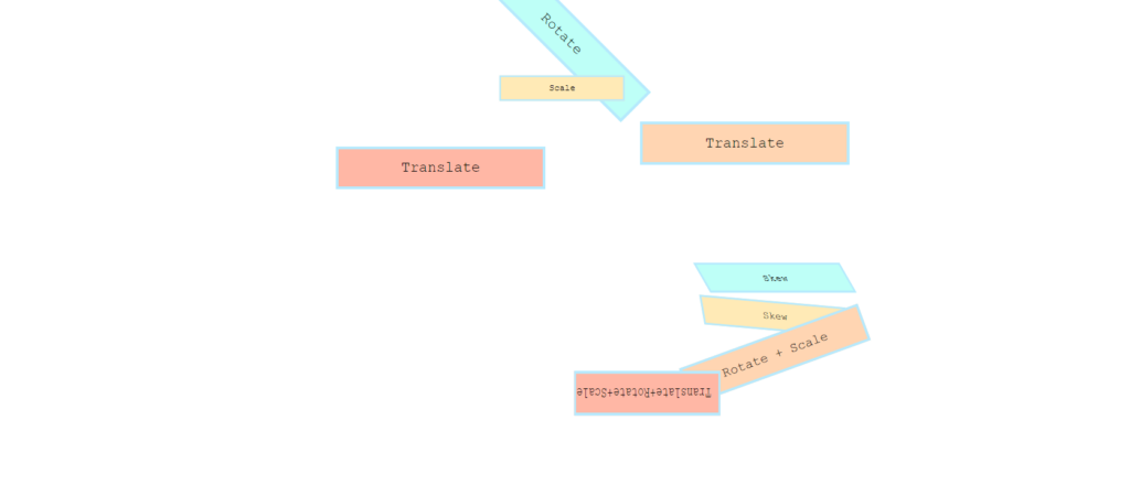
    <section>
        <h1>Rotate</h1>
        <h1>Scale</h1>
        <h1>Translate</h1>
        <h1>Translate</h1>
    </section>
    <section>
        <h1>Skew</h1>
        <h1>Skew</h1>
        <h1>Rotate + Scale</h1>
        <h1>Translate+Rotate+Scale</h1>
</section>CSS:
h1 {
    background-color: #befff7;
    border: 5px solid #b6eafe;
    color: #000000;
    padding: 0.7em;
    width: 300px;
    text-align: center;
    margin: 20px auto;
    font-family: 'Courier New', Courier, monospace;
    font-weight: lighter;
}

h1:nth-of-type(2n) {
    background-color: #ffeab6;
}

h1:nth-of-type(3n) {
    background-color: #ffd5b2;
}

h1:nth-of-type(4n) {
    background-color: #ffb7a5;
}

section:first-of-type h1:nth-of-type(1) {
    /* transform-origin: bottom right; */
    transform: rotate(45deg);
}

section:first-of-type h1:nth-of-type(2) {
    transform: scale(0.6);
}

section:first-of-type h1:nth-of-type(3) {
    transform:translateX(300px);
}

section:first-of-type h1:nth-of-type(4) {
    transform:translate(-200px ,-50px);
}


section:nth-of-type(2) h1:nth-of-type(1) {
    transform:skew(30deg);
}

section:nth-of-type(2) h1:nth-of-type(2) {
    transform:skew(10deg, 5deg);
}

section:nth-of-type(2) h1:nth-of-type(3) {
    transform:rotate(-20deg) scale(1.3);
}

section:nth-of-type(2) h1:nth-of-type(4) {
    transform: translateX(-300px) rotate(0.5turn) scaleY(1.5);
}

section:nth-of-type(2){
   transform: scale(0.7) translateX(500px);
}
Result: